Posts mit dem Label orange werden angezeigt. Alle Posts anzeigen

Donnerstag, 27. November 2014

Thanksgiving

Hello!

Today some people celebrate Thanksgiving. Here in Germany there is no thanksgiving, but people already get ready for Advent-Christmas-marathon with mountains of sweets to be eaten and lakes of hot wine punch to be drunk.
Let's join the celebration of the harvest and plentifulness of the autumn!

 Autumn colours are created with some orange nuances and pink, yellow and light brown sponged over the base colour (010 gleaming apricot by p2 LE Beauty Stories). Also the mini polish by Yves Rocher Brun cuivré is very autumn-like.
 Stamping plates I used:
Bundle Monster BM-H13 on middle, ring and pinky.
Bunny Nails HD-E on thumb and index.

Sonntag, 27. Juli 2014

Amur Tiger

Today's challenge is International Tiger Day, which is held on 29th July. Tigers are amazing animals, the biggest cats in the world, but graceful and beautiful.
One very poetic description of a tiger was made by Yann Martin in his bestseller-book "Life of Pi":
He was incredibly muscular, yet his haunches were thin and his glossy coat hung loosely on his frame. His body, bright brownish orange streaked with black vertical stripes, was incomparably beautiful, matched with a tailor's eye for harmony by his pure white chest and underside and the black rings if his long tail. His head was large and round, displaying formidable sideburns, a stylish goatee and some of the finest whiskers of the cat world, thick, long and white. Atop the head were small, expressive ears shaped like perfect arches. His carrot orange face had a broad bridge and a pink nose, and it was made up with brazen flair. Wavy dabs of black circled the face in a pattern that was striking yet subtle, for it brought less attention to itself than it did to the one part of the face left untouched by it, the bridge, whose rufous lustre shone nearly with a radiance. Tha patches of white above the mouth came off as finishing touches worthy of a Kathakali dancer. The result was a face that looked like the wings of a butterfly and bore an expression vaguely old and Chinese.
How can you not admire such creation of Mother Nature? It's impossible.
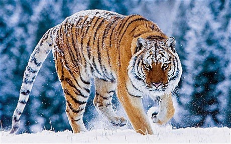
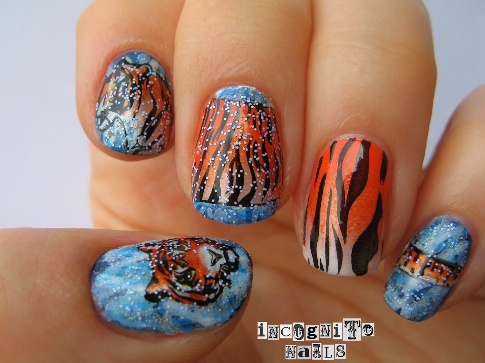
My mani was inspired by this picture:
http://www.telegraph.co.uk/sponsored/rbth/features/8174492/Vladimir-Putin-backs-fight-to-save-the-Amur-tiger-following-Russian-rangers-WWF-award.html

It is a siberian or amur tiger.

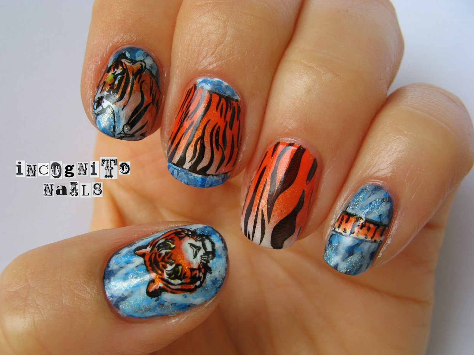
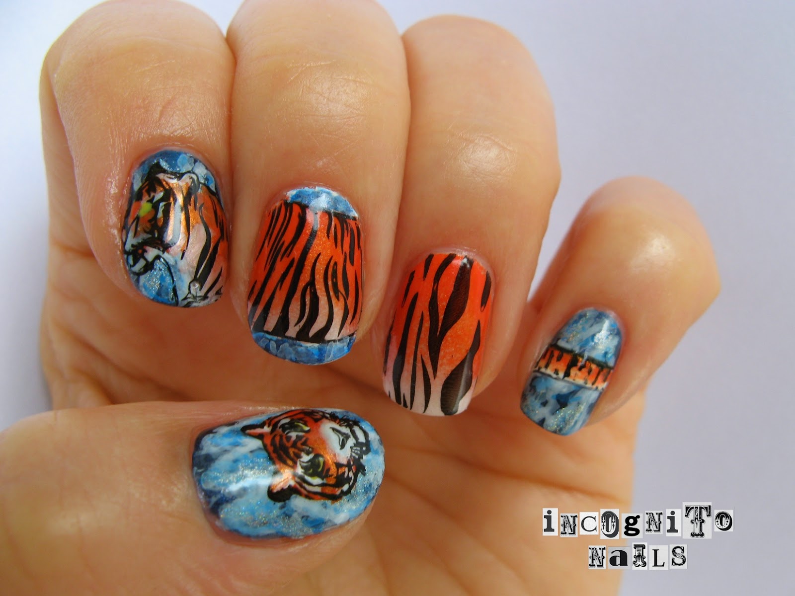
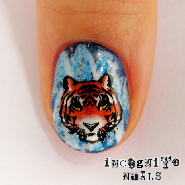
First I created the snow landscape over catrice Entering Atlantis: I painted with white and turquoise acryl paints fir trees covered with snow. I added also a bit Color Club Angel Kiss for sparkling.

Then the tiger body is gradient with white and orange. The head and body part on the middle finger are Moyou London Suki 01. The head on my thumb is also Moyou Suki, but 09. I did them as decals.

The ring finger is just a normal stamp over gradient. Cheeky CH2 for tiger thigh. And the tail is just freehanded.

After everything was done, I added a snow blizzard, which is surely happens in the cold Siberia. Actually the name of the snowy polish is very sommerlike: Blue Sky (Rival de Loop, Sorbet Nail Collection).

Montag, 1. April 2013

Candy Shock and Easter Eggs

Now even if the real spring doesn't seem to come to Germany, the polish manufacturer are competing to release more and more of new colours and limited editions. Apparently one of the new trends is tender colours, pastel tones and the like.
I couldn't resist these two:
They belong to the SOFT NAIL LACQUER LIMITED EDITION CANDY SHOCK. The pic above was taken in artificial light, the one down there - in the day light, which represent colours more truthfully.
First I tried out C04 Vanilla Love. The polish is very tender pastel yellow (you might even say vanilla colour) with fine yellow or goldish shimmering. One coat applied:
It looks somewhat transparent. It is also recommended to apply two coats. Two coats cover the nail pretty well. Artificial light makes the colour look more intense. But we don't wear polish only by daylight, do we?
Once more in daylight:
And I hope here the shimmer could be seen, at least in the bottle:
Such lovely background could not be wasted by leaving it plain. Since Easter monday isn't over I need more eggs and bunnies!

Dienstag, 26. März 2013

Colour Opposites

Day 16 of Laid Back 31 Day Challenge - Colour Opposites

First I had to confirm if I understand the colour opposites correctly. Generally I did, but my knowledge about colours was limited to some pairs like green - red. And I thought that blue would be opposed by yellow. But I learned from this circle the true opposite pair is blue and orange.

It was all the way better for me, because some time ago I spotted a lovely sweater with blue and orange stripes. It inspired me to do a mani with that colours.


I applied white polish as a base, stamped the knitted pattern from KONAD plate m69 and then painted orange and blue stripes:
Blue for stamping and stripes was Insta-Dri Blazing Blue. I mixed the orange colour from some other polishes like more intense orange and yellow.

Sonntag, 24. März 2013

Spiritual Venture

Today I wear the bright and intense orange shade with metallic effect.
It's alessandro Spiritual Venture from the winter collection "Catch me!". Doesn't it look spicy?
I stamped over it with Catrice Bruno Brownani and alessandro Shadow Street (opaque grey colour with silver shimmer):
The stamping plate is one of two newer releases by essence. It's a shame, they don't give proper numbers or names to their plates. Every time different designs are called like "02 style it up!". These particular designs remind me of mesoamerican textiles. Not exactly, but still a hint of it...