Sonntag, 31. März 2013

A new technique

Day 17 of Laid Back 31 Day Challenge - A new technique
Well, I found water marbling amazing when other people do it on tutorials. But my trial is not that pretty. God knows how much polish I used for experimenting, what colours/ polishes would work and how to create some kind of good patterns... *sigh* The only thing I discovered so far, that among not expensive polishes the best choice would be p2 and misslyn, then some colours by catrice and essence would also work. Metallics and other polishes with glitters are generally bad for water marbling.

So and here is my miserable failure with egg colours since we have Easter today. White is snow-white by misslyn, and yellow polish is p2 Color Victim 790 summer to go!


Samstag, 30. März 2013

Easter Eggs

Е-ей! Заўтра будзе каталіцкі Вялікдзень. Куды не паглядзішь, трапіш на зайчыкаў, яйкі і куранятак. Чамусьці ў Эўропе засталіся папулярнымі паганскія сімвалы, можа стацца, што Саус Парк мае рацыю ў сваем тлумачэнні зайцоў на Вялікдзень. Праўда - яна як вядома недзе побач.
Некалькі тыдняў таму я набыла шаблоны серыі "Вясновы час" ад Nailways (галандскі онлайн-шоп). Зараз самы час карыстацца імі!

Yeah, Easter! But the catholic one. There are bunnies and eggs and chickens everywhere...
For some time I got the Spring Time set of stamping plates by Nailways. Today it was a perfect day to use it.

Я зноў ухапілася за лак з "гелевым выглядам" ад p2. Гэтак ён яшчэ зробіцца маім улюбёным лакам... Цёмна-сіні колер добра спалучаецца з залатым (Catrice Goldfinger), які я ўзяла для акцента на безыменным пальцы. Я настэмпіла на сярэдні палец вялікае яйка золатам. Узор сам па сабе вельмі вялікі і не змяшчаецца цалкам на маіх пазногцях. Але большая частка такі змяшчаецца, так што можна лёгка распазнаць "размаляванае" яйка. Безыменны палец я настэмпіла другім узорам (дождж з вялікодных яек) тым жа сінім лакам.

So I resorted once again to the "gel like looking" polish by p2. It combines perfectly with gold (Catrice Goldfinger). I stamped the middle finger nail with a big patterned egg. The pattern itself is too big for my nails, but the most part of it could be still placed on so that you can recognize the EGG. And my ring finger is painted with gold, but stamped with the same blue polish.


Я не задаволена маім фотаапаратам. Тут можно ўбачыць розніцу, калі здымаць пры дзённым святле.

I am not really satisfied with my camera. :( You can see the difference in the daylight.

Freitag, 29. März 2013

Incognito!

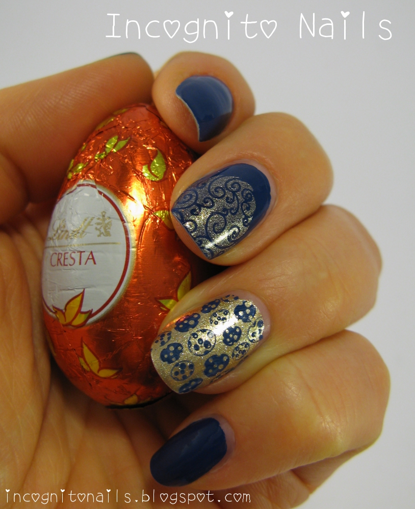
Who could imagine that? Incognito Nails got their own chewing gums! Look here:

No-no, I didn't lobby the board of directors of Perfetti Van Melle (manufacturer of MENTOS) for creating my special incognito flavour. They just came alone to the idea of incognito. :) Because incognito sounds enigmatic and certainly cool :)
I could not ignore such lucky coincidence and bought it. As well I was eager to create a mani matching the design of 
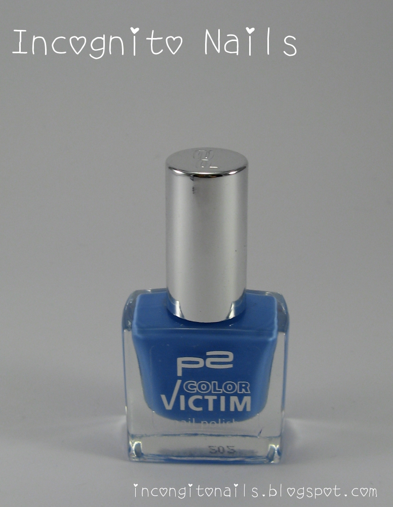
incognito bubblegums. First of all I added two polishes to my collection:


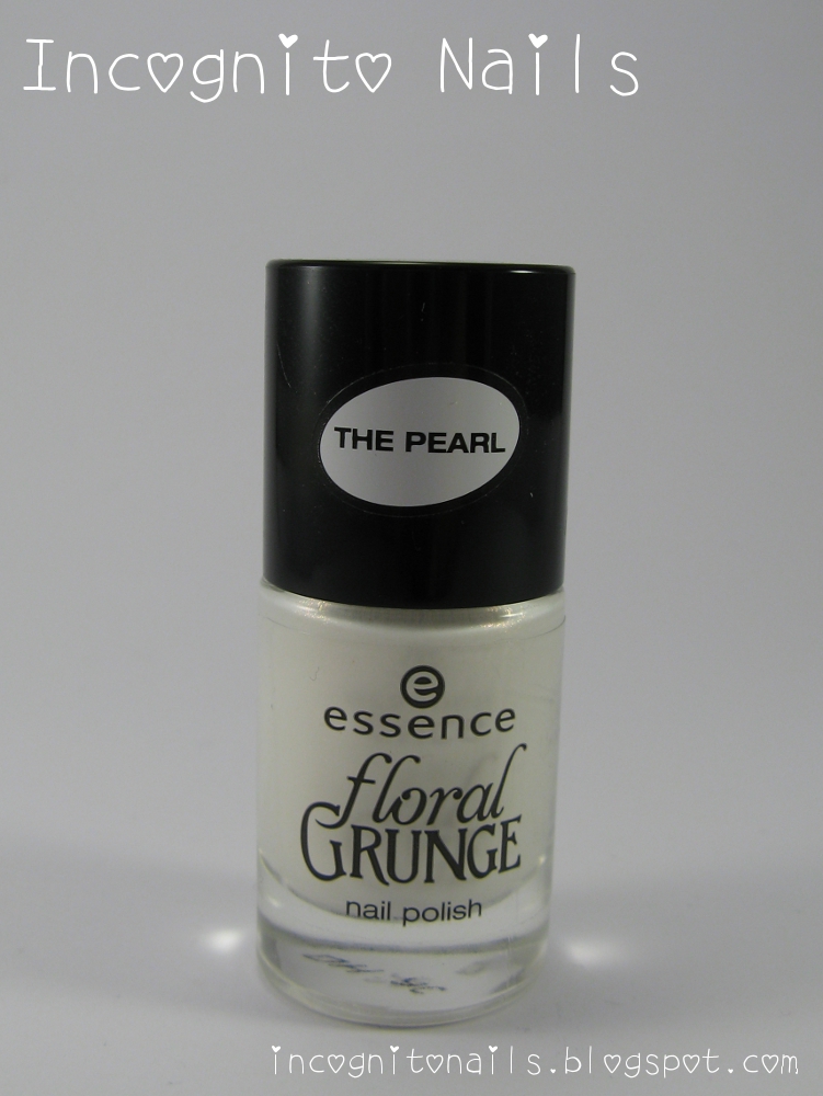
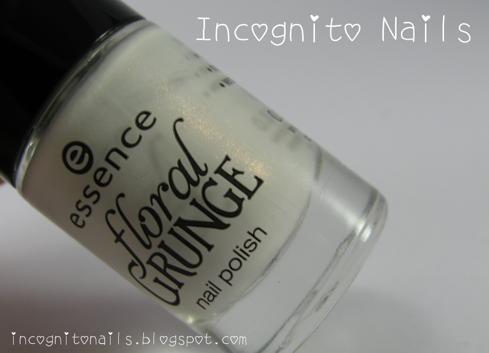
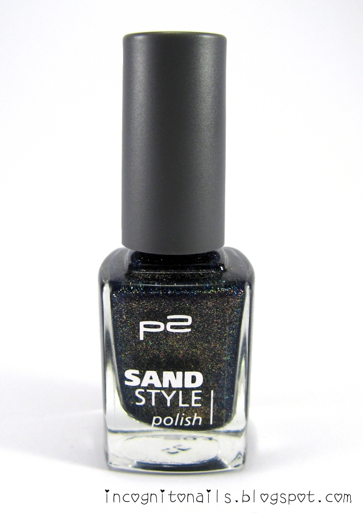
They belong to the new stock of polishes by p2. Color Victim is an old polish subline. But the colour 920 up in the air! is new.

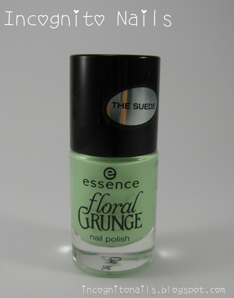
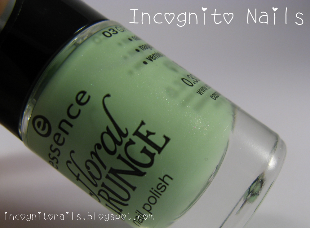
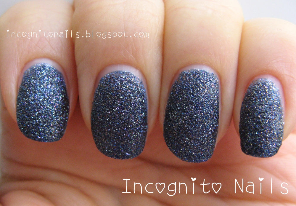
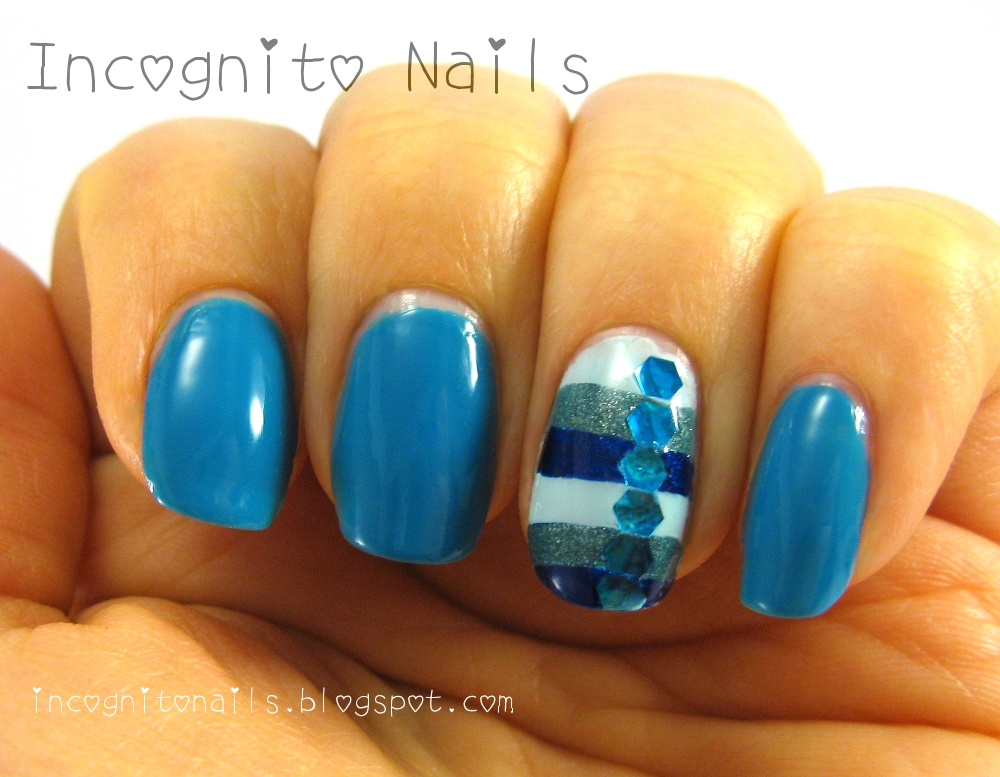
And the other one with deep royal blue colour is a new line with the pretension to look like gel nails. I don't know why are they all struggling for "gel look". Is that so desirable? Also Catrice claimed their new stock to be "gel look quality"...

Anyway gel look or not I found this couple to be perfect match for my incognito design.
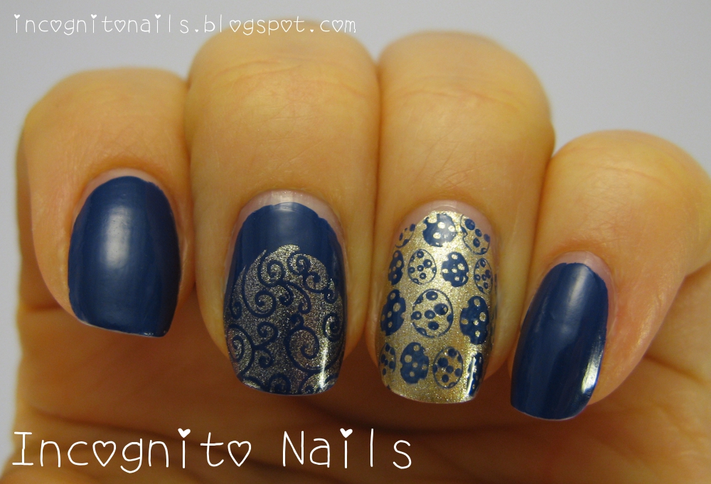
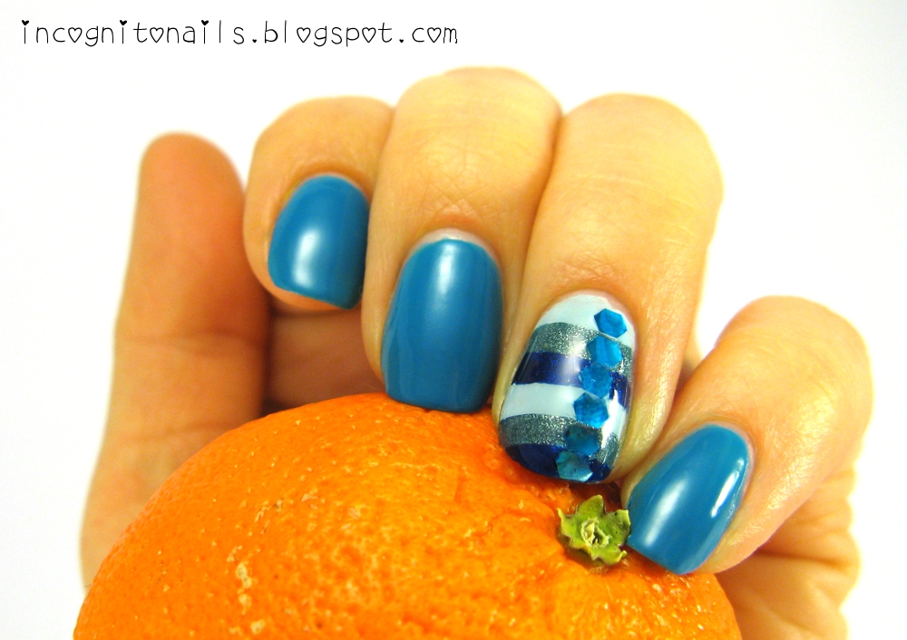
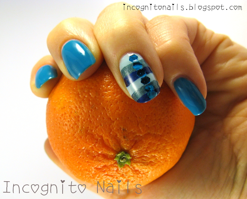
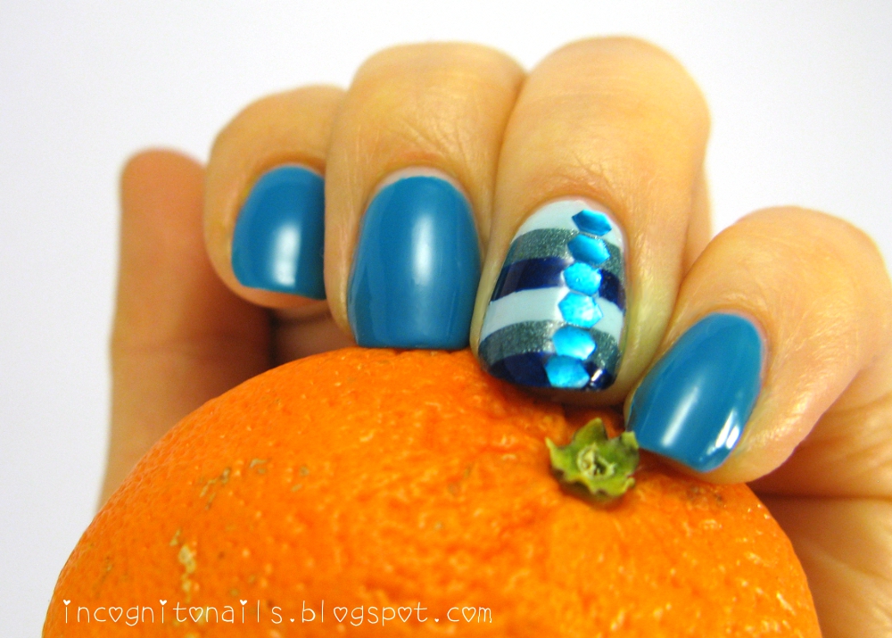
The royal blue which is called 
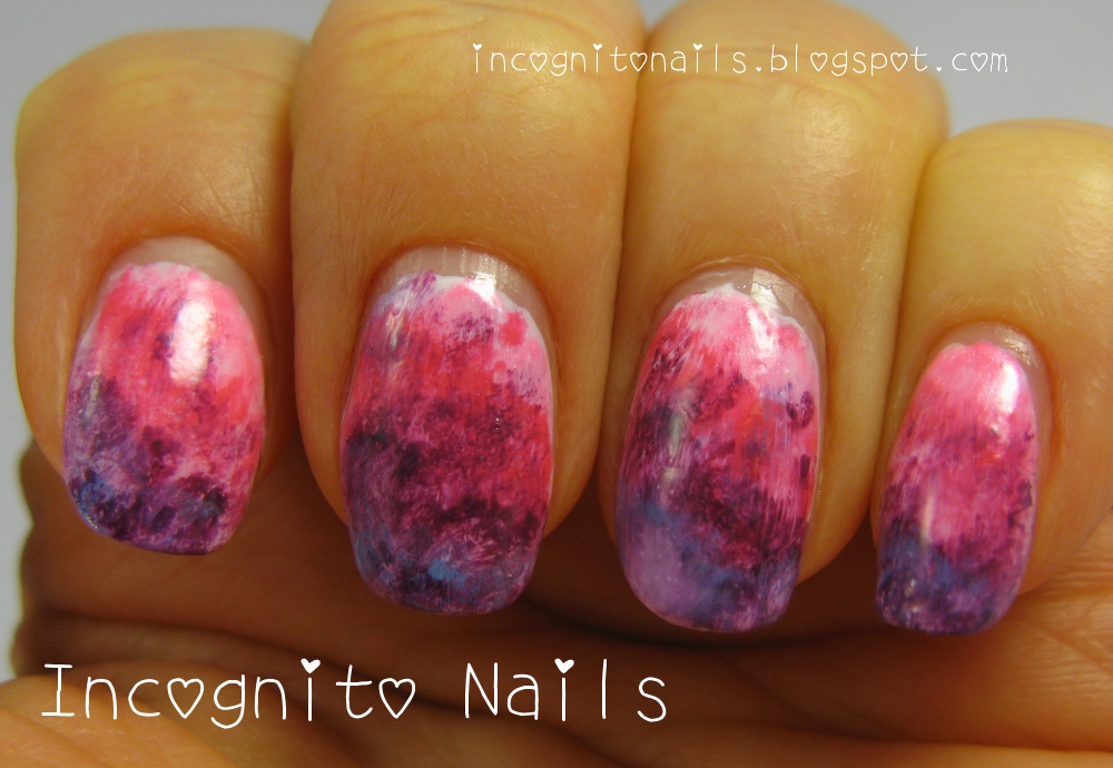
110 ocean lady. I used it for all nails. For the accent nail I sponged both colour like gradient techniqie.
The question marks are from the stamping plate GALS GA43 (Fairy Set). To get them coloured I used tip from this blog. The idea was to let the pattern dry on your stamper, colour it on stamper, let it dry. Then you paint a top coat over it, let it dry once again and then you can peel it off and use on your nail like a decal. It's easier and funnier then the technique of double stamping, in which I would never succeed. My stamper (just like some Russian saying about bombs is) never hits the exactly same ground twice. :) I used acrylic paints and also polishes for colouring of question marks.

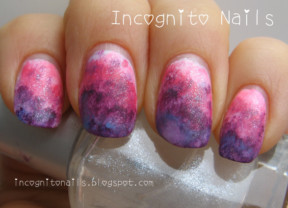
Here you can better see the "gel like look" of the new p2 polish. Isn't it super glossy? You can even see my camera in the reflection on the nails...
And here we are together: incognito nails and incognito bubblegums. :)
I have to say, the flavour of them (I mean the chewing gums) is really difficult to distinguish. There is some mint, but also something fruity what I didn't recognized. :)


Isn't is funny?

Donnerstag, 28. März 2013

Floral Grunge

I didn't expect that essence brings their next limited edition so soon. But here you are: 

It's called floral GRUNGE. I bought only three colours of five. Coral and lila were not that interesting.

The white one with the name LILY BLOOM is pearly white with very fine light pink and golden shimmer:


I am not sure if my picture can show any of shimmering... The polish is opaque, but you get the better look with at least two coats.

The next polish is minty GRUNGE ME TENDER.

It has more distinguishable shimmer, which I would call blueish and silvery. I think, the cosnova is very into shimmers, because almost everything they release these days for essence or catrice contains shimmer.

And when we combine the two:
The idea of final look was something like that:
But it didn't work out well. I used some lace stickers also by essence, but for french manicures. I struggled to get them right in the line and ruined most of my nails. :(

Dienstag, 26. März 2013

Colour Opposites

Day 16 of Laid Back 31 Day Challenge - Colour Opposites

First I had to confirm if I understand the colour opposites correctly. Generally I did, but my knowledge about colours was limited to some pairs like green - red. And I thought that blue would be opposed by yellow. But I learned from this circle the true opposite pair is blue and orange.

It was all the way better for me, because some time ago I spotted a lovely sweater with blue and orange stripes. It inspired me to do a mani with that colours.


I applied white polish as a base, stamped the knitted pattern from KONAD plate m69 and then painted orange and blue stripes:
Blue for stamping and stripes was Insta-Dri Blazing Blue. I mixed the orange colour from some other polishes like more intense orange and yellow.

Montag, 25. März 2013

Water Colour

Day 15 of Laid Back 31 Day Challenge - Water Colour.
Water colour is a technique to thin down drops of colour polishes with acetone so that they look like watercolour. The base is usually white. I did it also over white. I don't own pure acetone, so I took polish remover with acetone instead. Maybe that was the reason, but watering down war probably not watery enough or the polish would get thicker too soon, so that the colours are not homogenously smooth. The thin top coat by p2 (glamorous FINISH nail art top coat), that I don't normally use because it tends to smut my stamping if it's done with intense dark colours, helped a little to smooth the areas of different colours and kind of blended them.
To smoothen colours even more I used another top coat by p2 - silver matte.
And then I thought that in this purply mist some mystic "fern" should grow: it's one of the first essence stamping plates and Insta-Dri Blazing Blue:

Sonntag, 24. März 2013

Spiritual Venture

Today I wear the bright and intense orange shade with metallic effect.
It's alessandro Spiritual Venture from the winter collection "Catch me!". Doesn't it look spicy?
I stamped over it with Catrice Bruno Brownani and alessandro Shadow Street (opaque grey colour with silver shimmer):
The stamping plate is one of two newer releases by essence. It's a shame, they don't give proper numbers or names to their plates. Every time different designs are called like "02 style it up!". These particular designs remind me of mesoamerican textiles. Not exactly, but still a hint of it...

Samstag, 23. März 2013

Sand Style Polish

I don't know what polish manufacturer started the trend, but first I saw OPI's "liquid sand" from Mariah collection. And the next was the cheap brand p2 with theit new products and among them was a series of "Sand Style Polish", which was instantly and constantly sold out in almost every dm-store.
Well, the German text on the bottle says "Angesagter Effektlack" (like "this effect polish is the flavour of the month"). Whether it's true or the people were affected with this statement... I just don't know.

I bought one of six (?) shades, named "050 confidential", which is blue with mostly silvery sparkles. It's recommended to put two coats and let them dry very well. So I did.
Previously I tried to paint Sand Style over my repair polish which I usually wear as base coat.  Unfortunately the Sand Style polish wouldn't get dry at all or did it so slowly that my patience was already over. I found it not very useful and nail friendly.
As the polish went dry, it got a rough texture like sand and it's glittering was a bit less:

Once more in artificial light:
Obviously the polish contains some hard particles which are glittering and in particular building the effect of sand in dry state. But (and I meant this as unfriendly for nails) while taking off the polish you should take right amount of polish remover. Other way and if you rub you nails too hard these particles could scratch your nail plates.

Overall I find the polish interesting and beautiful, and if you compare the prices it's very reasonable if you want to get fashionable effect like texture on your nails.

Mittwoch, 20. März 2013

Stamping

Day 14 of Laid Back 31 Day Challenge - Stamping
Yeah, stamping!
I've tried this combination already, and I think chocolate color and copper look good together. This time both polishes belong to Catrice: 720 Bruno Brownani with its intense choco-brown tone and 870 Copper Cabana (does exactly what it says on the tin :) ).
The lovely pattern comes from KONAD plate m70.

Sonntag, 17. März 2013

Cheer Up Mani

Day13 of Laid Back 31 Day Challenge - Cheer Yourself Up Mani

To cheer up you need something sparkly, funny and bright. So I found a good occasion to use the essence nails design kit "Vintage District" with their big blue glitter:
One of my favourite colours is turquios. So I painted all nails with "boat trip" by p2. Unfortunately my camera doesn't do a good job for some colours like turquios or pink.
My accent nail has stripes of misslyn "heaven on earth", butter LONDON "Victoriana" and Golden Rose matte blue (maybe 10 is a number of that shade, but I'm not sure).
Then I planted a glitter per a stripe so that I've got another stripe across the tricoloured stripes.